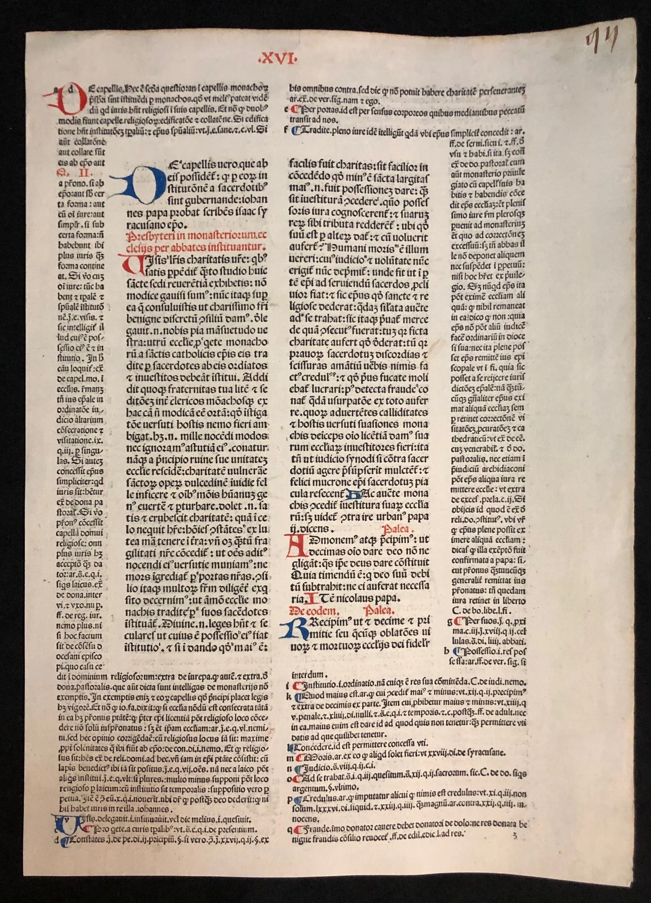
A leaf from the Corpus luris Canonici, (c.1490 Incunabula)
This is a remarkable example of an incunable (a book printed before 1501) or a very early 16th-century legal text. It features the classic "scholastic layout," where the core text is surrounded by a dense web of secondary commentary.
Here are the most interesting points regarding its history, typography, and construction:
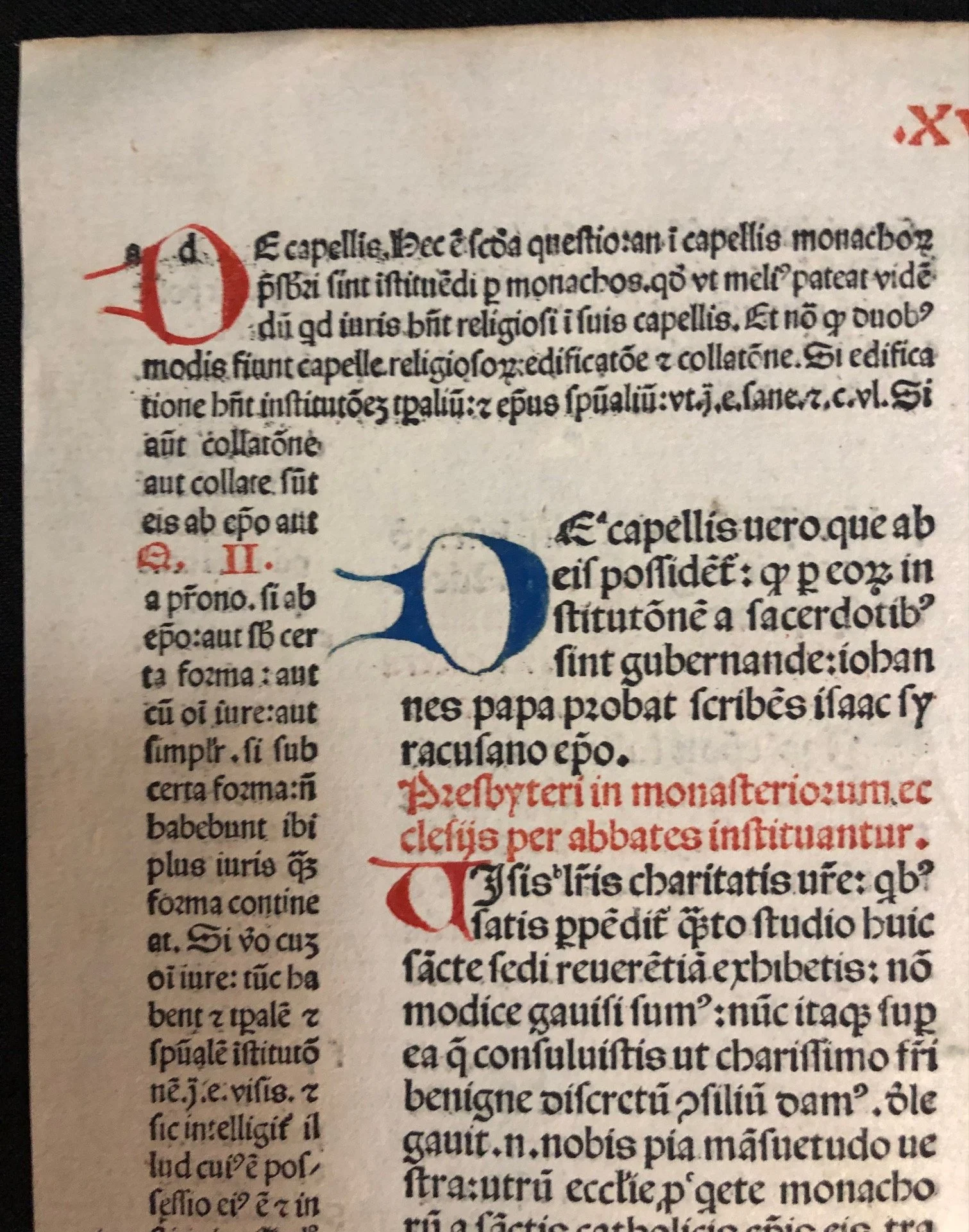
1. The "Glosses" (The Layout)
The most striking feature is the Glossa Ordinaria layout. The larger type in the center is the primary text (likely Canon Law, such as the Decretals of Gregory IX or Gratian’s Decretum). The smaller, denser text surrounding it is the commentary.
• This was designed so a scholar could read the law and the various legal interpretations simultaneously.
• The small letters (a, b, c...) interspersed in the main text act as "footnotes," guiding your eye to the corresponding explanation in the margins.
2. Hand-Finished Rubrication
Even though the text is printed using a press, the vibrant red and blue decorations were added by hand after the page was printed.
• Lombard Capitals: The large blue "D" and red "P" were painted by a rubricator.
• Paragraph Marks: Notice the small red and blue "C"-shaped symbols (called pilcrows) throughout the text. These were used to mark the start of a new argument or section, as paper was too expensive to waste on "white space" or new paragraphs.
3. Gothic Textura Typeface
The font is a classic Gothic Textura, designed to mimic the handwriting of high-status liturgical manuscripts.
• Abbreviations: To save space and labor, the printer used "scribal abbreviations." For example, a line over a vowel (like \bm{\bar{o}}) usually signifies a missing "m" or "n."
• Justification: Notice how perfectly straight the margins are. Printers used these abbreviations and varying widths of characters to ensure every line was exactly the same length.
4. Material Evidence
• The Folio Number: In the top right corner, you can see the hand-written number 94. This suggests this leaf was part of a massive, multi-volume set.
• Paper Quality: Given the date, this is likely rag paper (made from linen and cotton rags). It is significantly more durable than modern wood-pulp paper, which is why it remains so white and crisp after 500 years.
• Roman Numerals: The top center features the header .XVI., indicating the chapter or "Distinctio" currently being discussed.
5. Content Clues
The text mentions "Presbyteri in monasterio" (Priests in the monastery) and "papa" (Pope). Given the red header "Deecodem. Palea.", this is almost certainly a leaf from the Corpus Iuris Canonici—the body of laws governing the Catholic Church. The term Palea refers to specific additions made to the original teachings of Gratian.
For a specialist in rare manuscripts, a leaf like this is a perfect "teaching specimen" because it sits exactly at the crossroads of the medieval manuscript tradition and the printing. revolution.
275mm x 385mm
R3,000 (Sold April '26)