The Bridge on the River Kwai c.1970
The "Ster Films" Imprint and the Timeline Clue
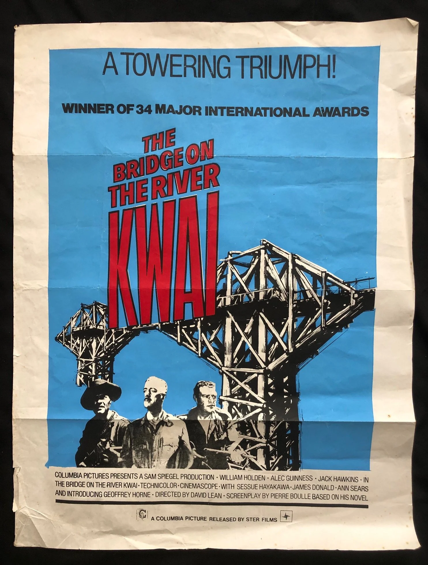
At the very bottom border, the text reads: "A COLUMBIA PICTURE RELEASED BY STER FILMS" accompanied by Ster’s sharp, four-pointed star logo on the right.
The History: The Bridge on the River Kwai swept the Oscars in early 1958. However, Ster Films was only founded in 1962 by the insurance conglomerate SANLAM to compete with the Schlesinger Organization's African Consolidated Theatres (which dominated the local market).
The Dating: Because this poster carries the Ster Films imprint alone (before its 1975 merger with Kinekor to become Ster-Kinekor), we can pinpoint this poster to a late 1960s or early 1970s South African theatrical re-release. Much like the Bond films, cinematic epics of this scale were continuously re-circulated through South African theatres and drive-ins for decades because local audiences had no access to television or home video.
Radical Structural Simplification of the Artwork
The original 1957 international poster campaigns (designed by artists like Tom Jung) were famous for their lush, full-color painted collages featuring the faces of William Holden, Alec Guinness, and Jack Hawkins set against explosions, jungle foliage, and the dramatic collapsing bridge.
This South African printing completely reimagines the marketing approach:
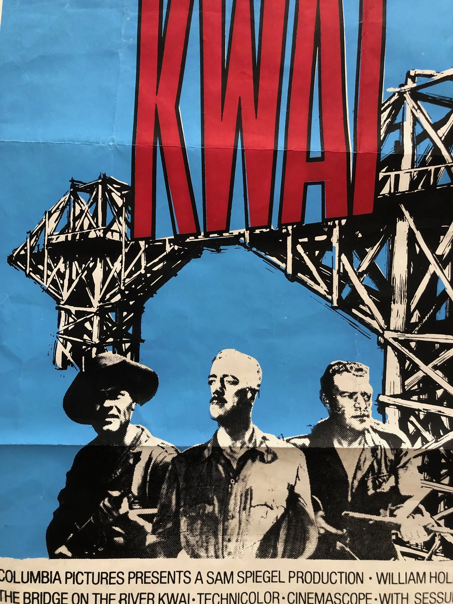
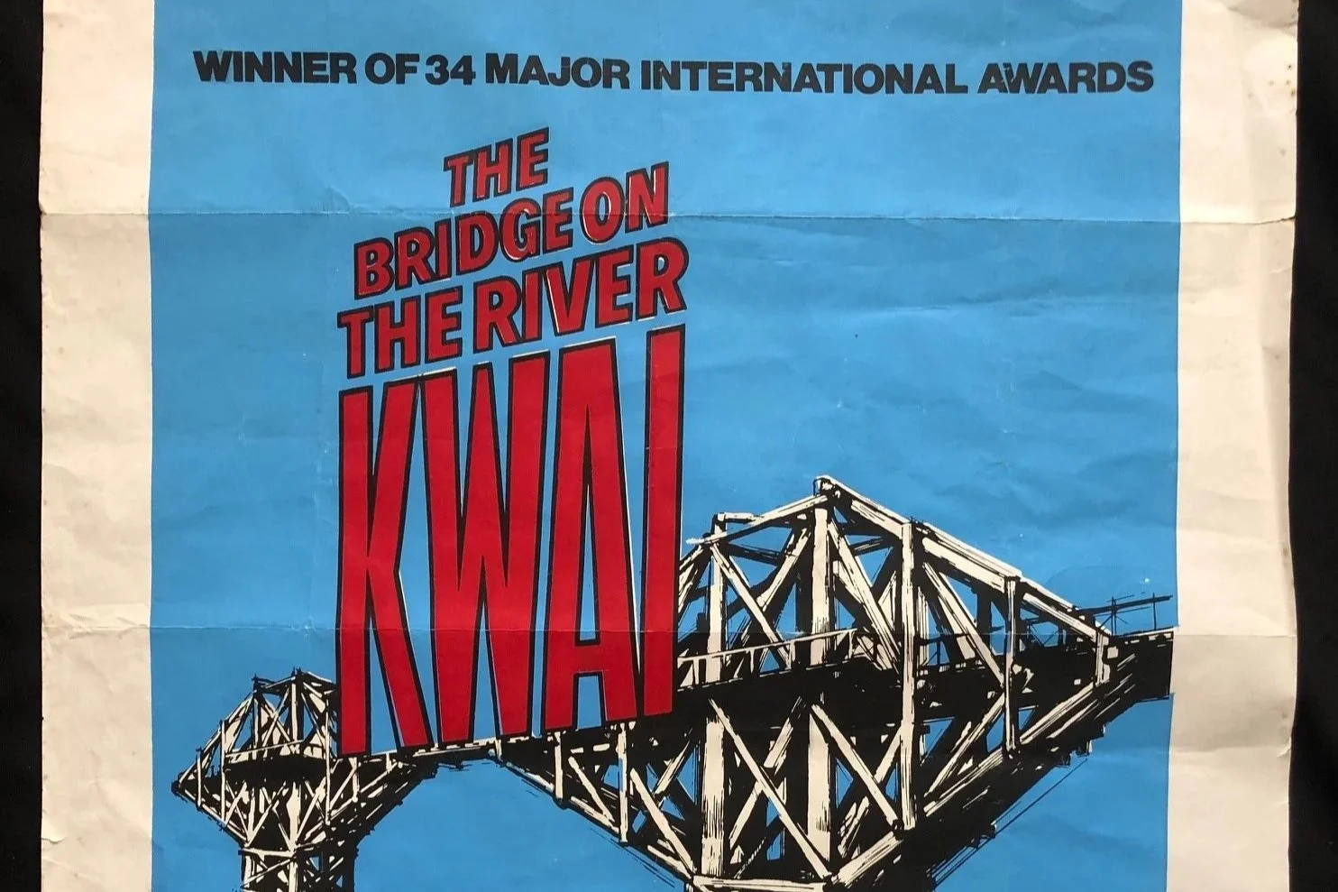
Stark Graphic Novel Aesthetic: The local designer stripped away the multi-color paintwork entirely, replacing it with a high-contrast, black-and-white ink graphic overlayed on a single solid block of sky-blue spot color.
The Bridge as the Star: By rendering the wooden bridge in massive, geometric black lines, the bridge itself becomes a towering, looming character that dominates the entire top half of the poster, arguably creating a much punchier modern layout than the cluttered original 1950s designs.
The "34 Major International Awards" Blurb
Across the top, the poster proudly proclaims: "WINNER OF 34 MAJOR INTERNATIONAL AWARDS." When the film was first released in late 1957, posters generally relied on the star power of William Holden or the intrigue of the plot. This specific tagline is an "acclimation blurb" that could only be used after the film had spent years gathering accolades worldwide (including its 7 Academy Awards and 3 BAFTAs). It tells us that the distributor was banking entirely on the film’s established legendary status to pull crowds back into South African cinema seats a decade after its premiere.
Local Typography and the "Kwai" Wordmark
The typography for the word "KWAI" is entirely distinct to this printing. It is an incredibly tall, compressed, hand-drawn serif font that stretches vertically across the bridge structure. This dynamic, aggressive lettering was custom-set or hand-drawn by a local graphic artist working for the South African printing house contracted by Ster Films, making the visual identity of this specific poster completely unique to southern Africa.
Utility and Condition
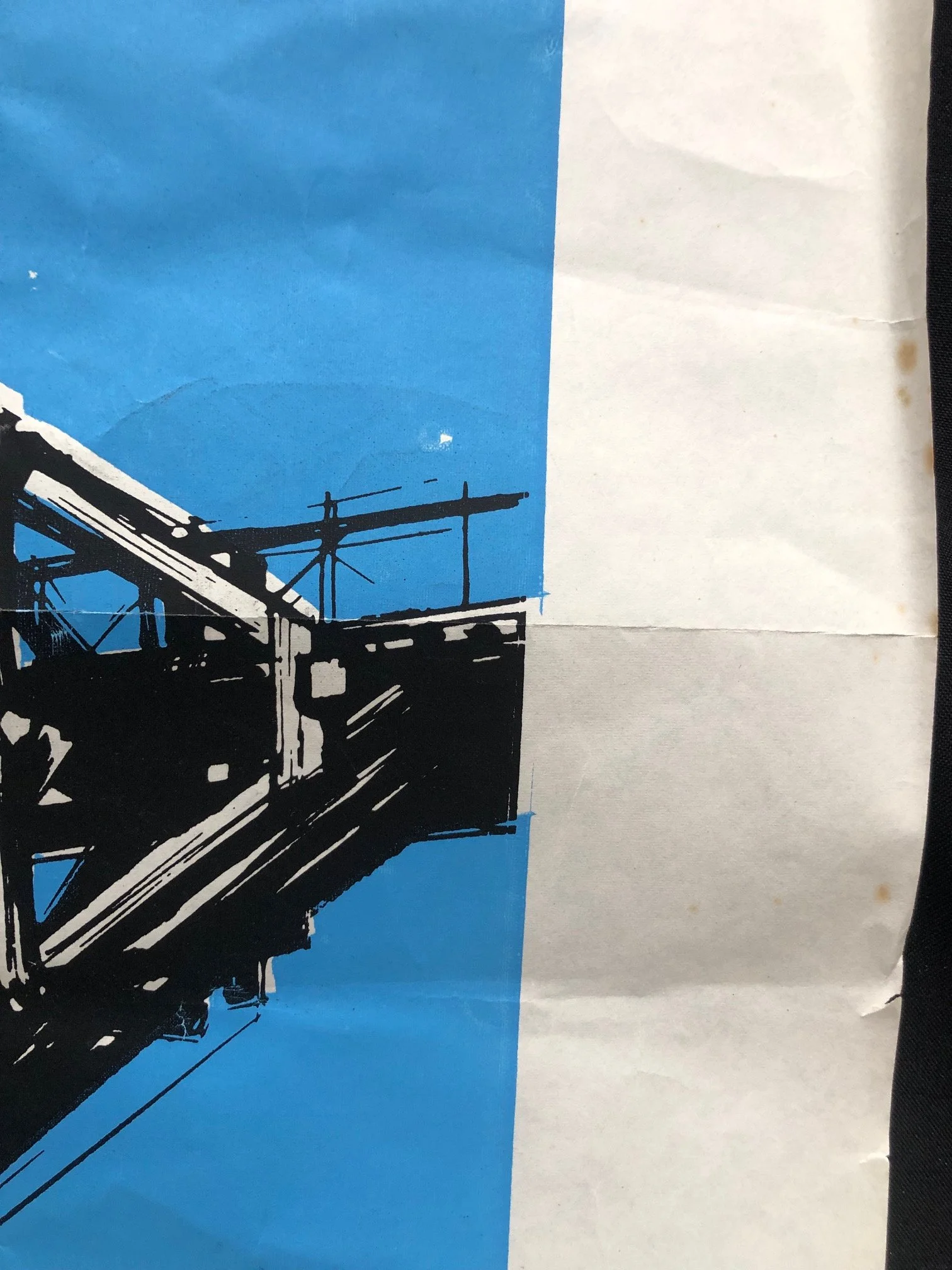
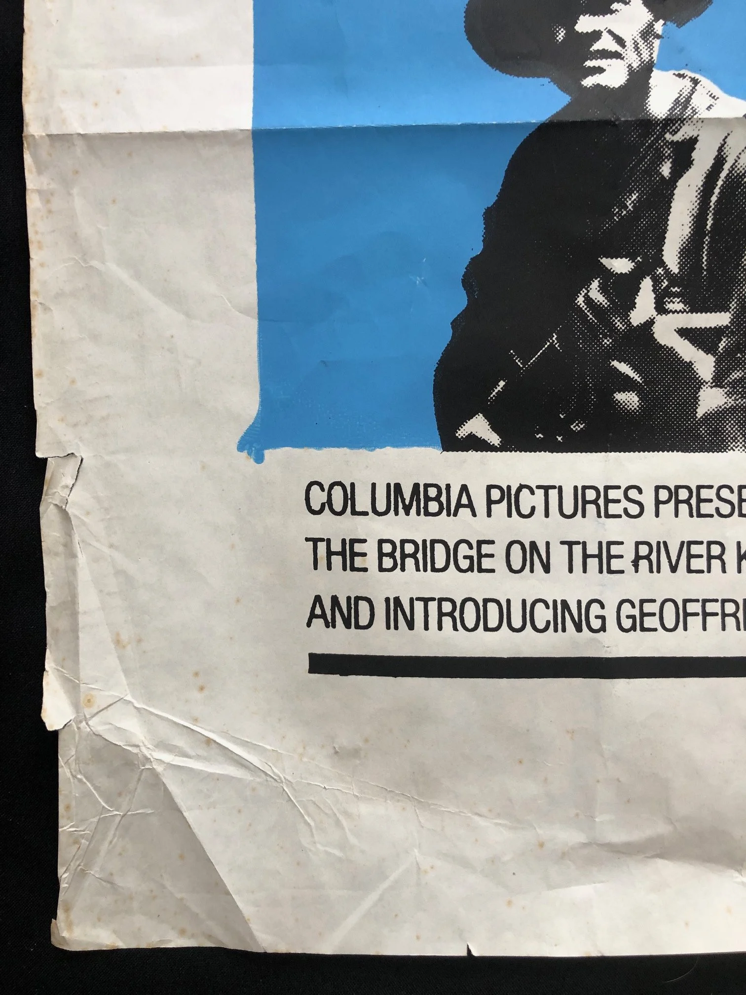
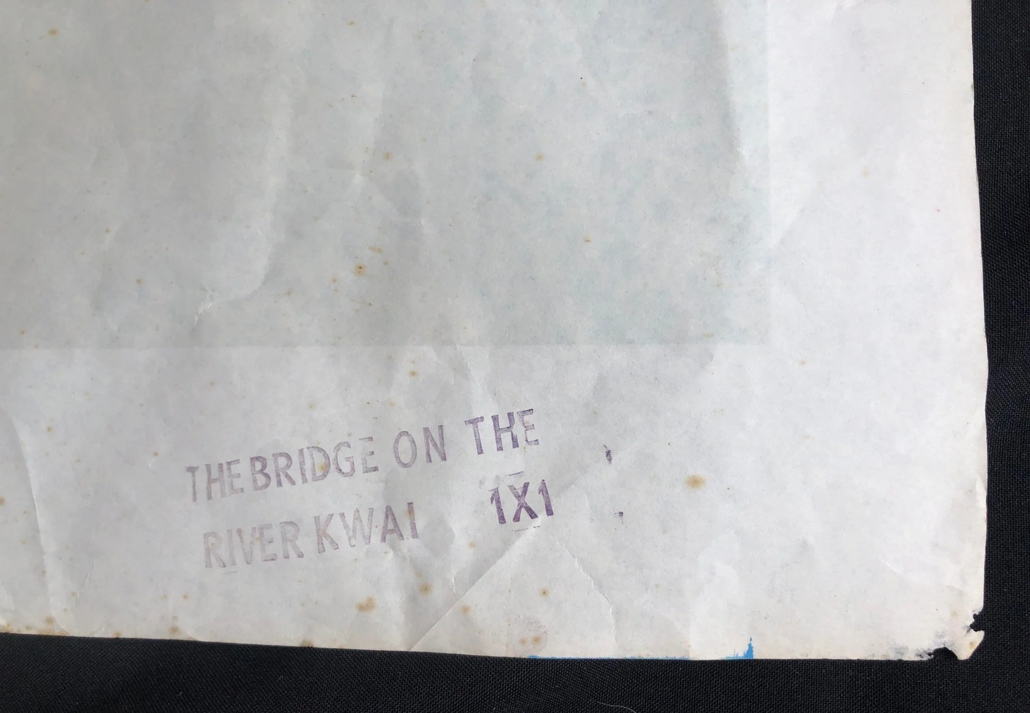
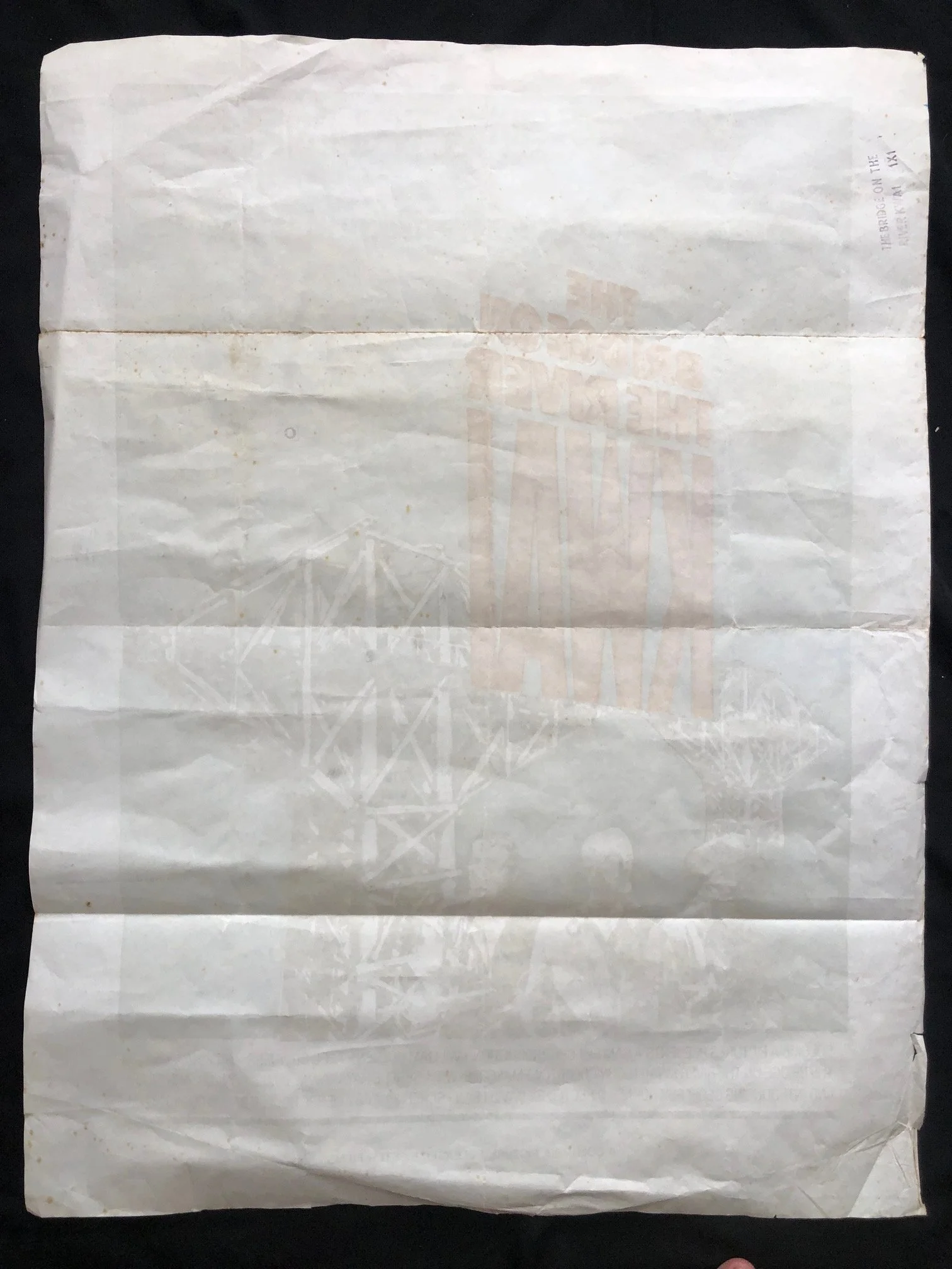
Torn at all edges; foxed and incorrectly folded.
The heavy horizontal and vertical creasing across the center reveals that this poster was folded down into a neat rectangle at the printing factory and mailed out to regional independent theaters or drive-ins in a flat packet. The slightly weathered margins and pin-holes in the corners show it actually saw real-world use on a theater display board, surviving the inevitable scrap heap that claimed the vast majority of local Ephemera from this era.
765mm x 1030mm
R2,500